I love communicating science and I am excited about the ways that data visualizations can engage scientists and non-scientist in discussion, brainstorming, and in the creation of new ideas and hypotheses. Last week in R-club (more about that later) we reviwed the Kaggle Kernel created by Martin Henze (AKA Teads or Tails) for the NY Taxi ETA Kaggle Competition (https://www.kaggle.com/headsortails/nyc-taxi-eda-update-the-fast-the-curious). It was AMAZING (more reading here: http://blog.kaggle.com/2018/06/19/tales-from-my-first-year-inside-the-head-of-a-recent-kaggle-addict/). One of the packages used in this competition that I had never heard of is ‘alluvial’.
Alluvial is a package in R that allows the user to make highly discriptive “data pictures” with a group of categorical variables. I wanted to see if I could get some data to make a similar plot. I used the ‘mlbench’ package in R and the BreastCancer data set, specifically (mlbench is awesome because it’s a collection of ‘machine learning benchmark problems’).
Getting set up:
install.packages("mlbench", repos = "http://cran.us.r-project.org") # machine learning data sets free for exploration
install.packages("tidyverse", repos = "http://cran.us.r-project.org") # for some helpful transformations performed on the data set
install.packages ("alluvial", repos = "http://cran.us.r-project.org") # for the beautiful plot
library(mlbench)
library(tidyverse)
library(alluvial)
data(BreastCancer)
dim(BreastCancer)
str(BreastCancer)
Checking some variables of interest for plotting:
# are there equal numbers of benign and malignant classes?
summary(BreastCancer$Class)
## benign malignant
## 458 241# what about the distribution of values for thickness, adhesion, and cell size?
summary(BreastCancer$Cl.thickness)## 1 2 3 4 5 6 7 8 9 10
## 145 50 108 80 130 34 23 46 14 69summary(BreastCancer$Marg.adhesion)## 1 2 3 4 5 6 7 8 9 10
## 407 58 58 33 23 22 13 25 5 55summary(BreastCancer$Epith.c.size)## 1 2 3 4 5 6 7 8 9 10
## 47 386 72 48 39 41 12 21 2 31Transform the data set:
# I like to select just the variables I'm going to use, but I typically name this something new.
BreastCancer2 <- dplyr::select(BreastCancer, Class, Cl.thickness, Marg.adhesion, Cell.size)

# Now I group and tally, because I will need a count or frequency of all of the possible groups of variables and the outcome (here, Class (benign or malignant)) to make the alluvial plot.
BreastCancer3 <- BreastCancer2 %>%
  group_by(Class, Cl.thickness, Marg.adhesion, Cell.size) %>%
  tally() %>%
  spread(Class, n, fill = 0)

# Here I have to say, as a newbie to gather and spread, it occured to me that I might more simply combine the previous step with the one, below, to create some nicer, cleaner code. Here is my "long-hand" version, for now.

# Create the new frequency column and specifically group benign or malignant "class" as the new variable, "diagnosis":
BreastCancer4 <- gather(BreastCancer3, "diagnosis", "frequency", 4:5)

#I always use head() or View() to ensure that what I've done is what I really intended to do. Those steps are omitted here.
Make the alluvial plot:
alluvial(BreastCancer4[,1:4], freq = BreastCancer4$frequency,
         col = ifelse(BreastCancer4$diagnosis == "benign", "blue", "yellow"),
         border = ifelse(BreastCancer4$diagnosis == "benign", "blue", "yellow"),
         hide = BreastCancer4$frequency == 0,
         cex = 0.7)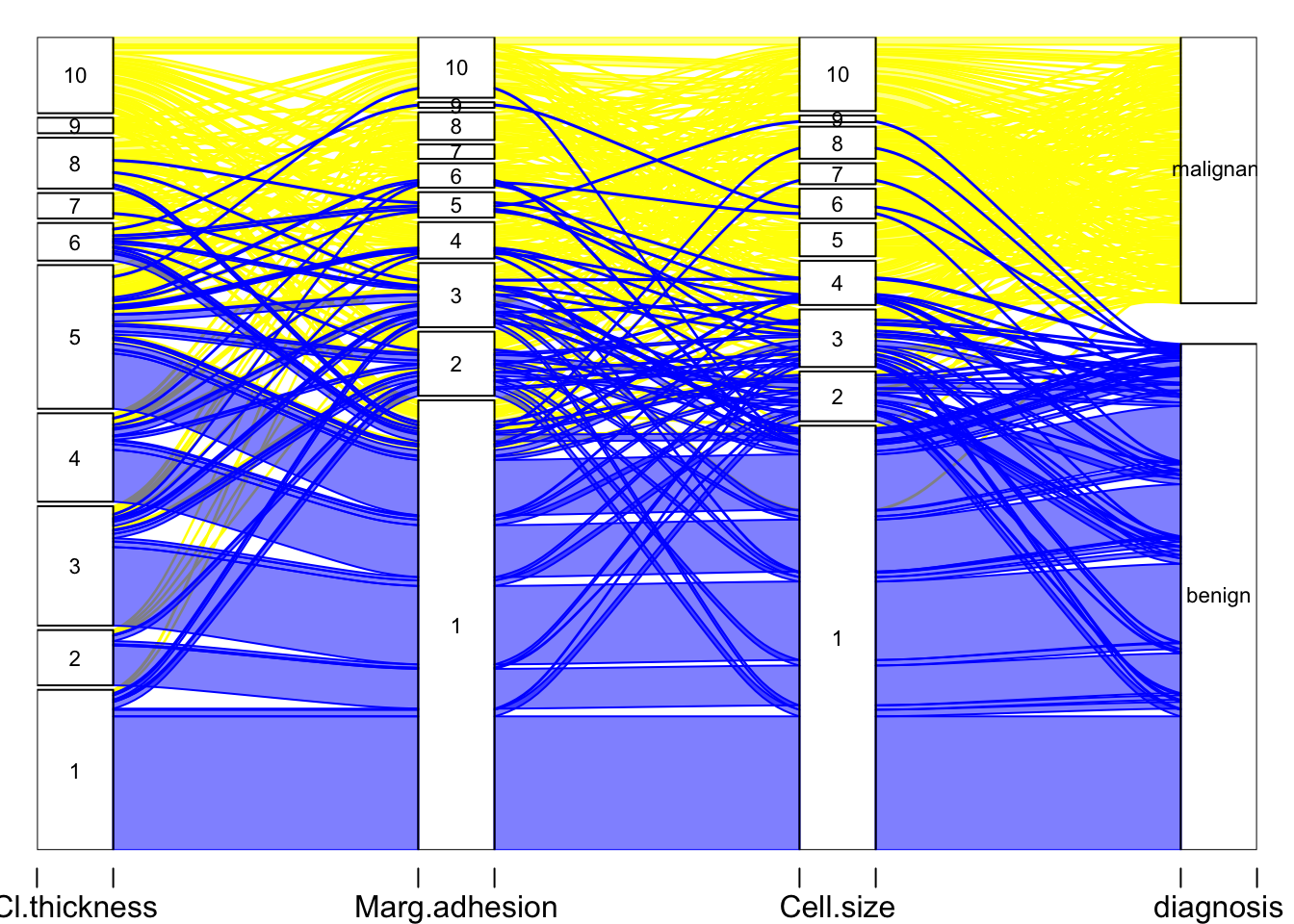
A simpler plot:
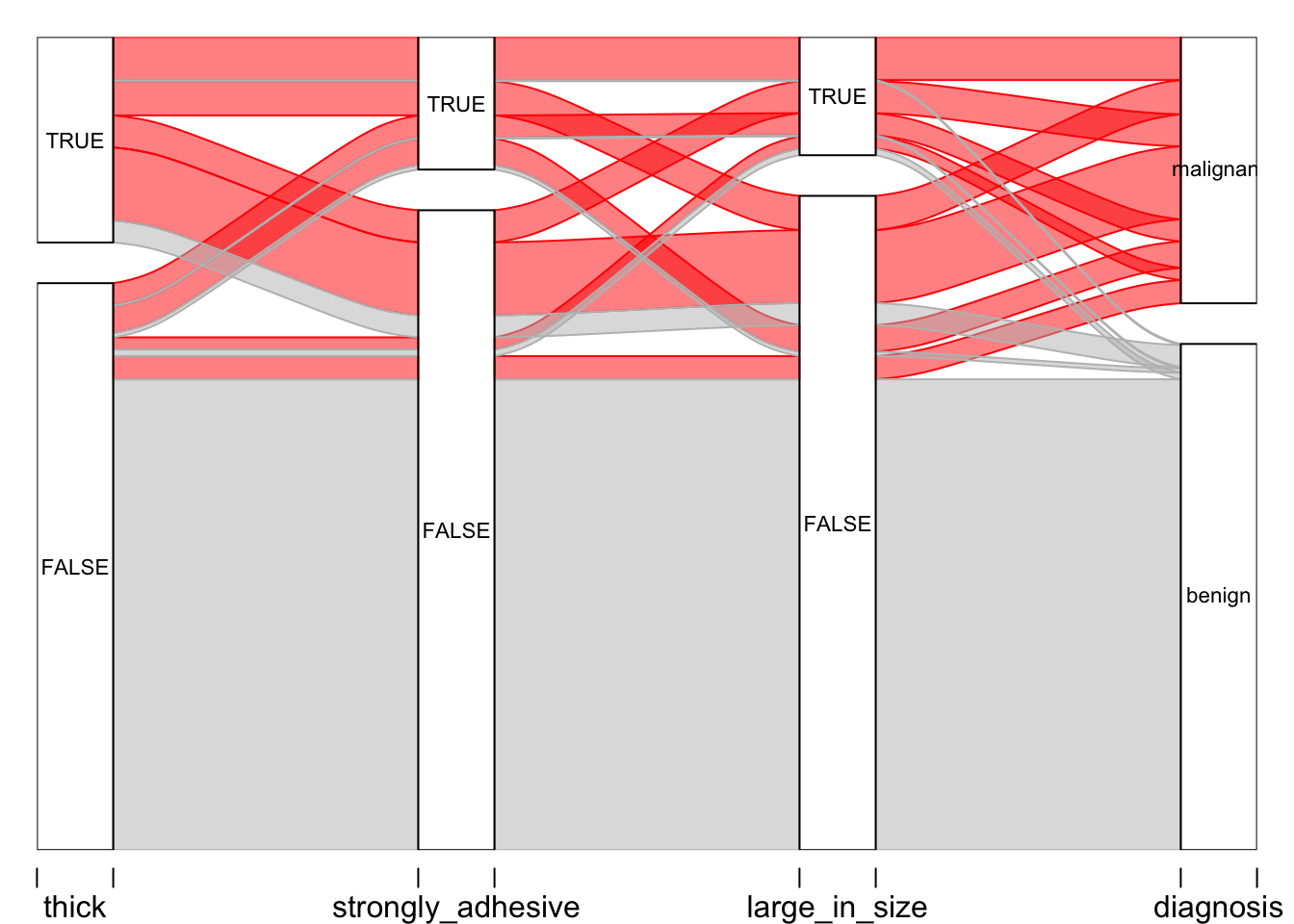
# After creating this plot, I realized that it might be nice to go back and re-define the 3 variables (thickness, adhesion, and size) into something that could be viewed more easily.

# First, I made new variables, "thick", "strongly_adhesive", and "large_in_size" using the mutate function. The original variables Cl.thickness, Marg.adhesion, and Epith.c.size are now defined as TRUE if they are greater than 5 in the original data set (recall, each variable ranges from 1 - 10, if you take a look at the BreastCancer dataset or str(BreastCancer), above).
BC2 <- mutate(BreastCancer, thick = Cl.thickness > 5, strongly_adhesive = Marg.adhesion > 5, large_in_size = Epith.c.size > 5)

# Again, select just the variables I want.
BC3 <- dplyr::select(BC2, Class, thick, strongly_adhesive, large_in_size)

BC4 <- BC3 %>%
  group_by(Class, thick, strongly_adhesive, large_in_size) %>%
  tally() %>%
  spread(Class, n, fill = 0)

BC5 <- gather(BC4, "diagnosis", "frequency", 4:5)

# The plot, finally!

alluvial(BC5[,1:4], freq = BC5$frequency,
         col = ifelse(BC5$diagnosis == "benign", "grey", "red"),
         border = ifelse(BC5$diagnosis == "benign", "grey", "red"),
         hide = BC5$frequency == 0,
         cex = 0.7)